Fonts have more meaning to them then some might imagine. There is a psychology behind fonts. They can either drive one towards or against a webpage. A font that is difficult to read will be turned from often times; nobody likes to strain their eyes trying to figure out what something says. Easy to read yet exciting fonts drive the reader to be more intrigued by a site.
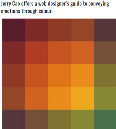
Colors also can affect the way one feels. Darker colors tend to be more sad and light colors more spunky. For example, yellow is happy, red is intimate and purple is mysterious.
Website Examples:

Disney: Simple yet intriguing, pictures and fonts to capture a child’s eye.
TMZ: Big Bold Letters, Red for intimate/sexual. Notice how theirs is very out there, very similar to the way they present their show. It was created to catch the attention of adults.

GQ: Simple yet sophisticated. The fonts are very easy to read, but bold.
NY Times: Very white and simple. It was created for all age groups. The colors, logos and fonts are not trying to be out-there or seeking attention.
NY Times: Very white and simple. It was created for all age groups. The colors, logos and fonts are not trying to be out-there or seeking attention.

The Verge: All different colors, multiple different fonts and sizes. Some stories scream louder than others. The colors may represent many different types of stories. They made it bold but not overwhelming.

Leave a comment